Review of Paid Dating Sites – TheUglyBugBall.com
Look and Feel
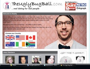
The look and feel of the website is not so catchy. The site has a slightly blue background with the front colored white. At the top you can see the site name in comic sans and the print partners of the site.
There is a man which is not so good looking and a welcome to reality note on the front. Also there are flags of different from which you need to choose your country for sign up.
Below that there are latest member list with their photographs and at the bottom line you will get 5 ugly truths about dating. The site also features some Google advertisements.
Registration Process
As I mentioned earlier, there is no sign up button on the site and you have to click on the flag of your country to register. As you click on that you can see join now form. You have to give your gender, name, date of birth, email address and password. If you are tired of filling these online dating site for and looking for some easy way you can login by you Facebook account. The site will send you a verification mail and your member id and password. You have to click on the link and you are ready to go through the site.
Login & Customizing Profiles
Here you did not get login automatically after registration and you have to click on the verification link provided with the mail and then you have to login by giving your email or member id and password.
Tags: jumpdates review, personals free dating site, teenage dating site, theuglybugball.com, top free dating


ecommerce website design…
Best Online Dating Services | Sites | Apps For Relationships - Jumpdates…
Thank you