Free Dating Site Review - Mingle2.com - Part 2
Look and Feel
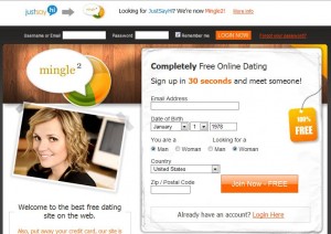
The home page of the mingle2 site is elegantly designed and crafted with orange and dark gray colors which are eye catching especially off the white background.
Login options for existing members are positioned to the very top and easy to locate.
I did not like the size of the button as they are very big in size in proportion to the rest of the page.
Registration Process
Like other websites this site also claims that registration process takes only 30 sec. My last experience with BookofMatches registration process took more than 1 min and profile was not fully competed. With mingle2 however, I was surprised to find that it took no more than 30 secs. to compete. The profile questions were general and sparse and I almost felt that I was sitting in quiz show. That said, I liked the fact that it was short and sweet. It also left you wanting more and felt that I wasn’t given an opportunity to express yourself. Like most other dating sites, the real ‘beef’ comes after you have joined the site where there are often a profile section to add further details about yourself.
After completing the registration process I received the confirmation email confirming that I was registered to the site. This is common on most sites and not just dating sites to avoid fake profiles and spam.
Tags: JustSayHi.com, Mingle2


[...] Next >>> [...]