Paid Dating Sites Review – Cheek’d.com
Look and Feel
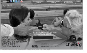
The look and feel of the website is not too appealing. The background is gray and at the front is a black and white photograph of two ladies of which one is being handed a cheek’d card by a gent. On the top of the page, you have the usual Twitter, Facebook, YouTube, Tumblr and Foursquare links and buttons. Sign up and activate card buttons are also located at the top.
There are no banner advertisements on the site page.
Registration Process
For registration to the site you just need to give your account information like username and password.
Once logged in, you can browse freely around the website and go to other pages where you will see the user menus arranged all at the top.
Below the page you will see the photo and profile completion forms but if you do not wish to give more information about yourself you can skip this step. This is one of the simplest types of registration process that I have ever seen.
Tags: cheek'd.com, jumpdates review, personals free dating site, teenage dating site, top free dating


